Homelab Dashboard
A live status page for everything running on my home server.
I run a small home server with Proxmox, Pi-hole, the *arr stack, qBittorrent and Jellyfin, and wanted one page that shows what's actually happening across all of them instead of switching between separate dashboards. This is a Next.js site that pulls live data from each service and lays it out as a set of status widgets.
Live preview
This is a real, working build of the dashboard. Every widget is interactive, but it's a static, front-end-only version with no connection to my home server. It's all mock data, and nothing you click is saved anywhere, so feel free to flip switches and click around.
Interactive dashboard
The data shown is not real, for security reasons. Click to explore.
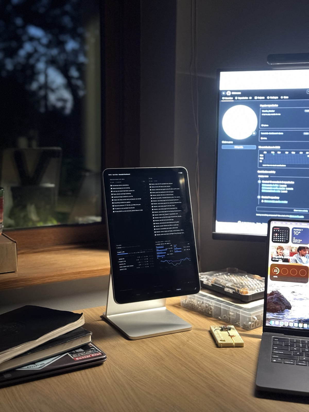
Built for a vertical screen
Day to day I don't look at this on a desktop browser. It runs in kiosk mode on an iPad mounted on a stand at my desk, so the real layout is designed for a tall, vertical screen rather than the wide one in the preview above.
What it monitors
The real dashboard tracks Proxmox VM and container status, Pi-hole's ad-blocking stats, download and library activity across Sonarr, Radarr and qBittorrent, what's playing on Jellyfin and Spotify, a Google Calendar, an IP camera and Ring doorbell, a scratch-off world map, a few smart-home devices, and even my own Wordle Worker results. Each service gets its own widget, and the layout is built to make it easy to add more.
How it's built
It's built with Next.js 14, Tailwind and Recharts for the charts. The real one runs in a Docker container on the home server and talks to each service's own API, with a mock-data mode for working on it remotely. The preview above is a separate, one-time export of that same mock mode, with no API routes, no server, and nothing that could touch a real device, so it's safe to host publicly and embed here.